

You see a shiny graph in your feed. Big red bar, tiny blue bar, bold headline. It looks clear and confident, so it must be true, right?
Not always.
For students, knowing how to read opinion polls is part of good critical thinking. Poll graphs are often used in essays, debates, and news reports. If you can spot when a chart is bending the story, you are already one step ahead of most people.
This guide walks you through the tricks that graphs use, what to check in the small print, and a quick checklist you can use every time you meet a poll in class, on social media, or in the news.
Key Takeaways
- Poll graphs are summaries of surveys, not pure facts about the whole population.
- Always check who was asked, how many people responded, and how the question was worded.
- Tricky graphs use things like chopped y-axes, odd time ranges, and 3D effects to change how big a difference looks.
- Simple, flat charts with clear scales are usually easier to trust than dramatic, glossy ones.
- A short, repeatable checklist will help you stay calm and clear when a graph is trying to shock you.
Table of Contents
- Key Takeaways
- Why graphs from opinion polls feel so convincing
- Start with the basics behind the graph
- Spotting common graph tricks in opinion polls
- Design choices that quietly nudge you
- A fast checklist for students
- Conclusion
- Frequently Asked Questions About How To Read Opinion Polls
Why graphs from opinion polls feel so convincing
Graphs feel like maths, and maths feels safe. Your brain sees a tall bar and a short bar, then jumps straight to a story: “Everyone supports this policy now.”
Poll graphs are also quick. You do not have to read a full article, you just glance, react, and scroll. That is exactly why campaigners and some media outlets like them.
Fact-checkers, such as Full Fact’s guide on misleading poll figures, show how easy it is for a single chart to push a strong message while quietly skipping key context. Your job as a student is not to reject every graph, but to slow your reaction down and ask a few sharp questions before you believe it.
Start with the basics behind the graph
Before you get into tiny scale tricks, check whether the poll itself is any good.
1. Who was asked?
Was it adults, voters, students, people in one city, or just users of a single website? A poll of “our followers” tells you more about that audience than about the country.
2. How many people were asked?
A sample of 150 people is much weaker than 2,000 people. For serious political polls, samples of 1,000 or more are common.
3. How was the question worded?
“Do you support a tax cut?” is not the same as “Do you support a tax cut that might affect school funding?” Words matter.
4. Who paid for or ran the poll?
Parties, campaign groups, and companies sometimes sponsor polls. That does not make them fake, but it should make you read more carefully.
If you want a deeper look at how professional polling should work, the British Polling Council’s guidance for journalists on opinion polls is a helpful resource, even for students.
Spotting common graph tricks in opinion polls
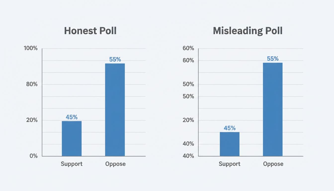
Side-by-side example of a fair bar chart and a misleading one that uses a truncated y-axis. Image created with AI.
Once you know the basics of the poll, move to the visual tricks. These are some of the most common.
Truncated y-axes make tiny gaps look huge
If a bar chart shows percentages, look at where the y-axis starts. If it starts at 0, the bar heights match the real difference in support.
If the axis starts at 40, the gap between 52% and 48% can look like a cliff edge. The numbers are close, but your eyes see a giant jump.
Quick test: cover the bars with your hand and read just the numbers. If the picture feels far more dramatic than the figures, the graph is doing extra emotional work.
Cherry picked time ranges hide the bigger picture
Line graphs show change over time, which makes them perfect for “Look, support is surging” stories. The trick is to pick the slice of time that tells the story you want.
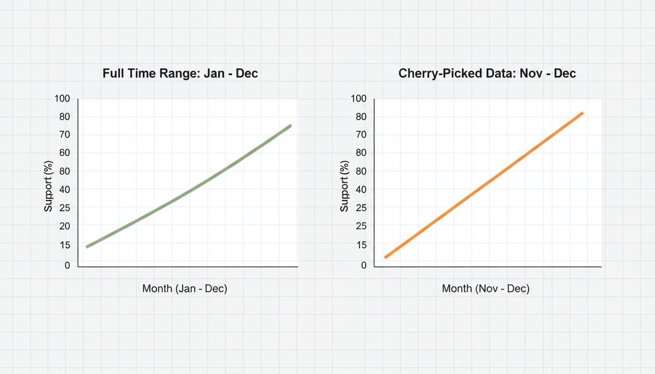
Comparison of a full-year poll trend and a cherry-picked short period that looks extreme. Image generated by AI.
A campaign might show only two months where support rises steeply, and ignore the ten months before when it bounced up and down. Ask yourself:
- When does the graph start and end?
- Could a different start date make the pattern look less dramatic?
A short video like Lea Gaslowitz’s TED-Ed lesson on how to spot a misleading graph is a handy visual explanation of this trick.
Squashed or stretched scales distort movement
Even when the axis starts at 0, the scale can still mislead. If each grid line on the y-axis is 1%, small changes look like big steps. If each line is 20%, then a huge real-world change can look flat.
When you read “support has doubled”, check if the graph scale fits that claim or if it hides the growth.
Design choices that quietly nudge you
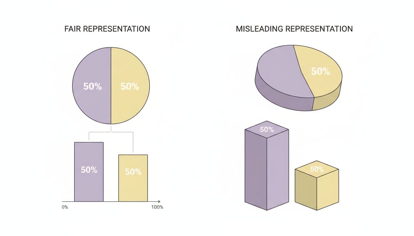
Comparison of simple 2D charts and distorted 3D charts using the same data. Image created with AI.
Not all tricks are about scales. Some are about style.
3D effects
3D bars and pie charts look stylish, but they bend shape and size. The front slice of a 3D pie can seem larger than slices that are the same percentage.
Pie charts vs bar charts
Pie charts are fine for rough “half and half” stories. They are weaker when the difference is small, such as 49% vs 51%. A bar chart shows that gap more clearly.
Colour choices
Bright, warm colours like red and orange grab attention. Greys and pale blues feel weaker. Designers might give “their” side a bright colour and the other side a dull shade to boost impact.
If a chart looks like an advert, with shiny effects, shadows, or extreme colour contrast, treat it with more care.
For a deeper dive into how data can be bent by design and method, Charney Research’s piece on ways to get misleading poll results is worth a look.
A fast checklist for students
When you face a poll graph in an exam source, a news article, or on social media, run through this quick list:
- Who was asked? Check the group and sample size.
- What was asked? Look for exact wording and answer options.
- Who paid for it? Note any group with a clear goal.
- How is the graph scaled? Check axes, time range, and grid lines.
- Does the picture match the numbers? Cover the graphic, read the figures, then uncover and compare.
If anything feels off, say so in your essay or class discussion. Being able to explain why a graph is misleading is far more impressive than simply accepting or rejecting it.
Conclusion
Polls are not the enemy. Used well, they give a quick window into public opinion and can support strong arguments in your essays and presentations.
The problem is when the visuals are tuned to shock rather than to inform. By slowing down, checking the method, and spotting classic graph tricks, you protect yourself from lazy claims and pushy headlines.
If you want to go further, the classic book How to Lie with Statistics is available as a free PDF edition and shows many of the same biases in a fun, clear way. With practice, reading opinion poll graphs becomes less about guessing and more about thinking carefully.
Frequently Asked Questions About How To Read Opinion Polls
Are opinion polls reliable?
Good opinion polls can be quite accurate, but they are never perfect. Reliability depends on sample size, how people were chosen, and how honest they were in their answers. Always treat poll results as an estimate, not a final truth.
What is a good sample size for a poll?
For national political polls, samples of around 1,000 to 2,000 people are common. Smaller polls can still be useful, but they have a wider margin of error, so small differences between groups may not mean much.
Why do some graphs not start the y-axis at zero?
Designers sometimes cut off the bottom of the axis to “zoom in” on small changes. This can help in science or economics when tiny shifts matter, but in opinion polls it often makes gaps look bigger than they are. If the axis does not start at zero, be extra careful.
What is the margin of error and why should I care?
The margin of error tells you how much the true figure could differ from the poll result. For example, if a party is on 48% with a margin of error of ±3%, the real support could be anywhere between 45% and 51%. When two results are inside each other’s margin of error, it is safer to say they are roughly tied.