

You’re scrolling between lectures and someone posts an unemployment chart that “proves” everything. It looks official, the line shoots up or down, and the caption dares you to disagree.
Before you share it (or use it in an essay), slow down. A chart can be true and still be misleading, a bit like quoting one sentence from a whole book and acting like you’ve read the plot.
This guide shows you how to verify unemployment chart claims without falling into the same cherry-picking trap.
Key Takeaways
- Viral charts often mislead through timeframe choices, y-axis tricks, or swapping definitions.
- Start by finding the original data source, not a reposted screenshot.
- Check whether the series is seasonally adjusted, and whether the data has been revised.
- Compare the chart to a trusted reference (for example, official labour market releases or established databases).
- Write a one-line verdict you could defend in class: what the chart shows, what it hides, and what’s missing.
Table of Contents
- Key Takeaways
- Why Viral Unemployment Charts Mislead So Easily
- Start With The Source, Not The Screenshot
- Check The Date Range And The Y-Axis Before The Story
- Confirm What “Unemployment” Means In That Chart
- Look For Seasonal Adjustment, Revisions, And Footnotes
- Cross-Check With A Neutral Reference, Then Write A One-Line Verdict
- How To Avoid Cherry-Picking When You Make Your Own Chart
- Conclusion
- Frequently Asked Questions About Verifying Viral Unemployment Charts
- What’s The Fastest Way To Verify A Viral Unemployment Chart?
- Why Do Two Charts Show Different Unemployment Numbers For The Same Month?
- Is A Chart “Wrong” If It Uses A Short Timeframe?
- Should I Trust A Chart If It Has A Logo Or Looks Professional?
- How Can I Use This In Essays Without Overcomplicating Everything?
Why Viral Unemployment Charts Mislead So Easily
Most viral charts aren’t “fake”. They’re framed.
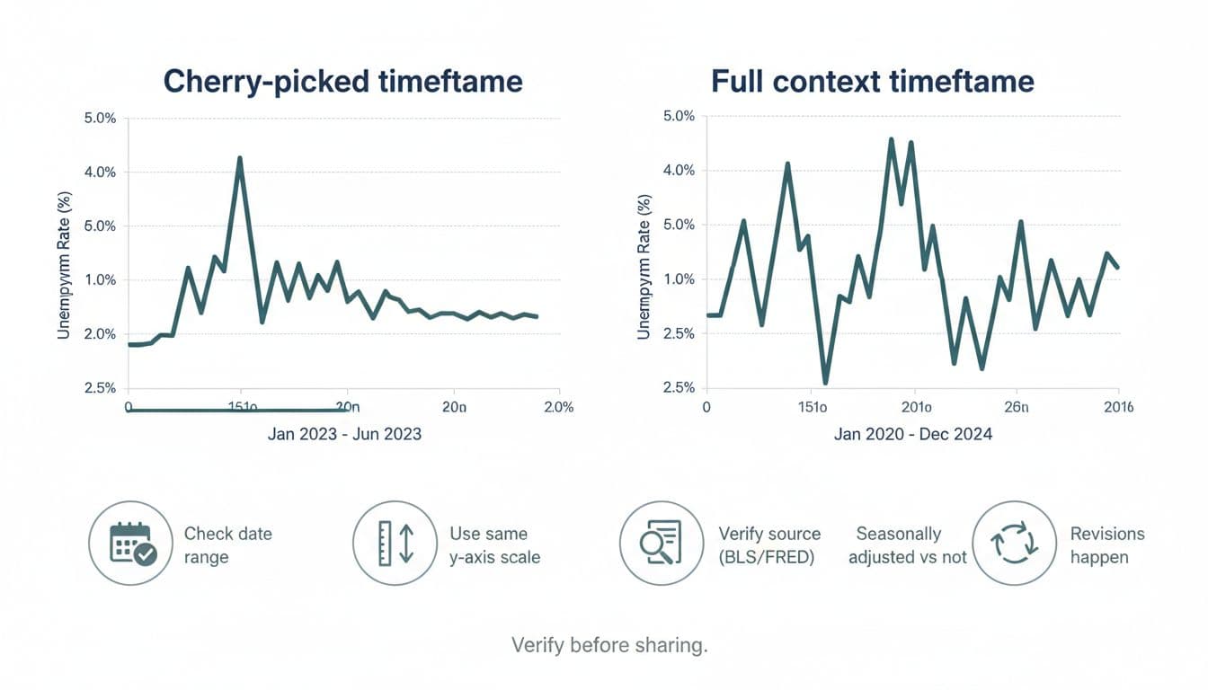
A common trick is picking a start date that flatters the story. If you start a graph right before a spike, it looks like panic. If you start right after, it looks like success. The data points can be identical, but the impression changes.
Another classic move is y-axis stretching. Think of it like taking a photo with a wide-angle lens. The scene is real, but the proportions feel off.
The final issue is that “unemployment” isn’t one simple number. It can mean different things depending on the country, the survey, and the definition used.
Start With The Source, Not The Screenshot
If you only do one thing, do this: trace the chart back to where the data comes from.
Look for a link, series code, or mention of an institution. If the post has none, treat it as unverified until proven otherwise.
Good starting points include:
- The UK’s official definitions and series notes from the Office for National Statistics labour market guide, which explains what the figures mean and how they’re built.
- Context on UK unemployment measures in A guide to unemployment data from OCSI, which is especially helpful if a chart mixes “claimants” and “unemployment”.
- For US charts, check whether the line matches the official BLS series, such as Unemployment Rate (LNS14000000), or a well-known public database like FRED’s Unemployment Rate series (UNRATE).
If you can’t find the source in five minutes, don’t share it as fact. Save it, label it, and come back later.
Check The Date Range And The Y-Axis Before The Story
A chart is a story about change, so the first questions are simple:
- What’s the start date and end date?
- What’s the y-axis range and unit?
A viral unemployment chart might show a jump from 4.8% to 5.1% and make it look like a cliff edge. But if the y-axis only runs from 4.7% to 5.2%, tiny moves become steep slopes.
Try this quick test: cover the caption with your hand. If the chart still “obviously” screams the same conclusion, it’s probably honest. If it suddenly becomes unclear, the caption might be doing the heavy lifting.
For UK readers, it also helps to check freshness. The most recent ONS data available at the time of writing (January 2026) put the UK unemployment rate at 5.1% for November 2025. A post using older months might not be wrong, but it could be avoiding newer updates.
Confirm What “Unemployment” Means In That Chart
This is where lots of students get caught out, because the labels sound similar.
In the UK, you’ll often see two different ideas shared as if they’re the same thing:
Unemployment rate: usually based on a survey definition (people without a job, actively seeking, and available to start).
Claimant count: people claiming certain benefits, which can move for reasons that aren’t pure job loss (rule changes, eligibility, how people apply).
A chart can be “about unemployment” while actually plotting claimants. That doesn’t make it useless, but it changes what you can argue from it.
Before you accept the conclusion, check the notes: does it say “unemployment rate”, “claimant count”, “aged 16+”, “working age”, or a specific subgroup? If the post doesn’t say, that’s a gap in the evidence.
If you want a wider student-friendly approach to checking bold claims without burning out, this student guide to fact‑checking political claims fits the same mindset: reduce the claim to a checkable question, then verify.
Look For Seasonal Adjustment, Revisions, And Footnotes
Unemployment data is noisy. Hiring changes by season, student jobs spike and drop, and holiday work comes and goes. That’s why many series are seasonally adjusted.
If one chart uses adjusted data and another uses unadjusted, you can get “contradictions” that are really just different settings.
Also, revisions happen. Early estimates can be updated when more survey responses arrive or methods improve. If someone posts a dramatic “record rise” using first-release numbers, they might never update the post when the figures change.
When you verify unemployment chart claims, read the small print. Footnotes often reveal things like:
- a break in series (method changed)
- a population change (for example, reweighting)
- a new base year
- missing months or estimates
Cross-Check With A Neutral Reference, Then Write A One-Line Verdict
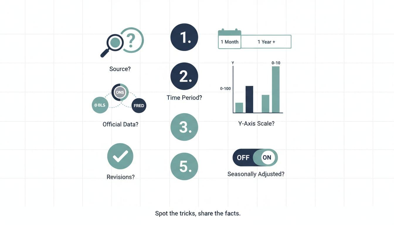
Once you’ve checked source, timeframe, and definition, do one more thing: cross-check the pattern against a neutral reference.
If the chart claims “unemployment has been soaring all year”, see whether the official series shows a similar slope. You’re not looking for pixel-perfect matching, you’re checking whether the claim is even in the right ballpark.
A quick checklist helps when you’re tired:
| Check | What To Look For | Why It Matters |
|---|---|---|
| Source | Official series or credible database | Screenshots lose context fast |
| Timeframe | Start and end dates shown | Short windows exaggerate change |
| Y-Axis | Range, units, and scale | Scale can manufacture drama |
| Definition | Unemployment vs claimants | Different concepts, different meaning |
| Adjustments | Seasonally adjusted or not | Seasonal swings can mislead |
| Revisions | Release notes or updates | Early numbers can change |
Then write a one-line verdict you could put in a seminar comment:
“This chart uses a short window and a tight y-axis, it’s based on claimants not the unemployment rate, and it leaves out later months.”
That sentence is what “not cherry-picking” sounds like.
If you want to name the trick when someone argues from a misleading frame, it helps to learn common reasoning traps. This guide on common logical fallacies every student should know is useful when a chart is paired with dodgy logic.
How To Avoid Cherry-Picking When You Make Your Own Chart
Sooner or later, you’ll make a graph for coursework. The same temptations show up, especially when you already have a conclusion in mind.
A fair approach looks like this:
Pick a timeframe before you look at the trend: for example, “last 10 years” or “since 2000”.
Keep the axis honest: don’t zoom in just to make a point look stronger.
State what the measure is: unemployment rate, claimants, youth unemployment, and so on.
Add a sentence of limits: what your chart can’t prove (cause and effect is a common overreach).
Your goal isn’t to sound neutral about everything. It’s to be accurate about what the data does and doesn’t show.
Conclusion
Viral charts feel convincing because they’re simple, but reality is usually messier. If you can trace the source, check the timeframe, confirm the definition, and scan for adjustments, you’ll catch most misleading unemployment posts in minutes. The skill isn’t being cynical, it’s being careful. Next time a chart pops up mid-scroll, take a breath and verify unemployment chart claims before you pass them on.
Frequently Asked Questions About Verifying Viral Unemployment Charts
What’s The Fastest Way To Verify A Viral Unemployment Chart?
Find the original source (ONS, BLS, or a reputable database) and match the timeframe and measure. If you can’t locate a source, treat it as unverified rather than “probably true”.
Why Do Two Charts Show Different Unemployment Numbers For The Same Month?
They might be using different definitions (unemployment rate vs claimant count), different age groups, or seasonally adjusted vs unadjusted data. Revisions can also change earlier values.
Is A Chart “Wrong” If It Uses A Short Timeframe?
Not always. A short timeframe can be valid if the post clearly says it’s focusing on that window and doesn’t pretend it represents the whole trend. The problem is when a short slice is presented as the full story.
Should I Trust A Chart If It Has A Logo Or Looks Professional?
Design isn’t evidence. A polished chart can still cherry-pick dates or scale. Trust comes from clear sourcing, labels, and data notes, not from how “official” it looks.
How Can I Use This In Essays Without Overcomplicating Everything?
Use one sentence to describe the chart, one sentence to name the limits, and cite the original source. That’s usually enough to show critical thinking without turning your paragraph into a detective story.